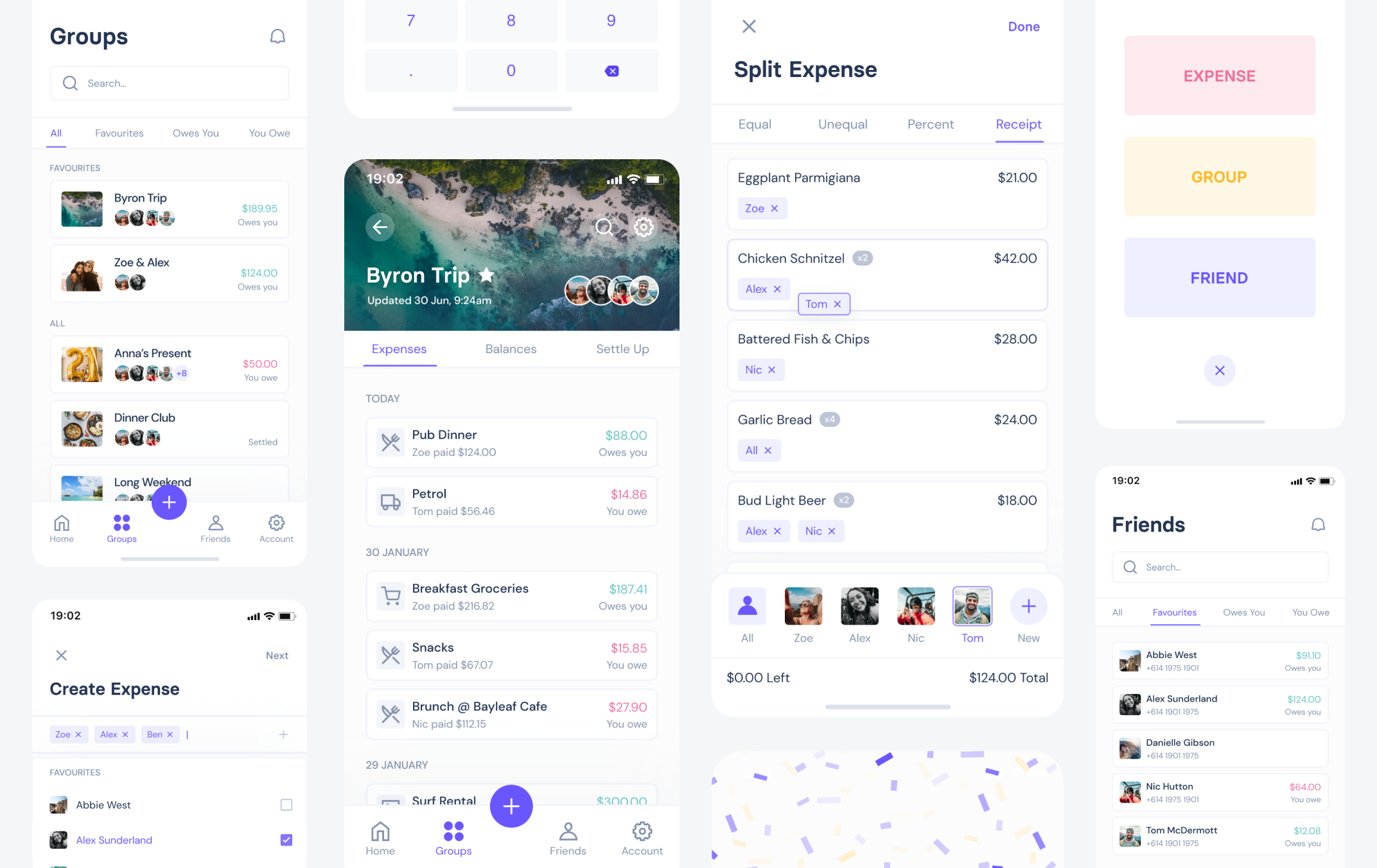
Splitty: Mobile App
Splitty is a mobile app that allows users to easily share expenses between friends, settle trip costs, divide household bills, and more. With a lot of complicated calculations happening in the background, users needed a simple and structured interface to provide assurance that all debts were settled fairly. Splitty was a personal project completed during the recent Covid-19 lockdown to not only stay sane, but attempt to address user experience issues found with the existing apps available.
Client
Personal
ROLE
UX Design,
UI Design
Year
2021
The problem
Earlier this year myself and 20 friends took a trip to the Hunter Valley wine region for a big joint birthday weekend - cooking meals together, visiting vineyards, mixing cocktails, making pizza, donning costumes and dancing all night. There were 6 different car-loads of groceries, some individual meals, a few partial group purchases and plenty of "I'll pay you back" promises. Things were getting complicated, so we hung onto our receipts and agreed to set up a Splitwise account to settle the debts later... however when later finally came, it took over 3 weeks to sort out who-owed-who from the weekend.
While half the group had been proactive and input expense details at the time, the other half were trying to iron out their receipts and remember who didnt have bacon with breakfast. Throughout this process the entire group complained about the app UX, including a clunky receipt-scanning feature, a lack of tools to inspect individual debts, unstructured lists, and the visual design in general... so I started taking notes. And after looking at reviews on the app store, it seemed other users shared similar frustrations. When working with some pretty complicated calculations, users needed a simple, structured interface to provide assurance all debts were settled fairly.
RESEARCH
Competitor Analysis
I started by testing out the existing solutions on the market, and created a competitve advantage table to get a better picture of where some apps shined and others failed. While there was definitely a clear standout, it left plenty of room for improvement. Using the initial feedback gathered from my group trip and from user reviews on the app stores, I started to pinpoint some of these areas of concern.
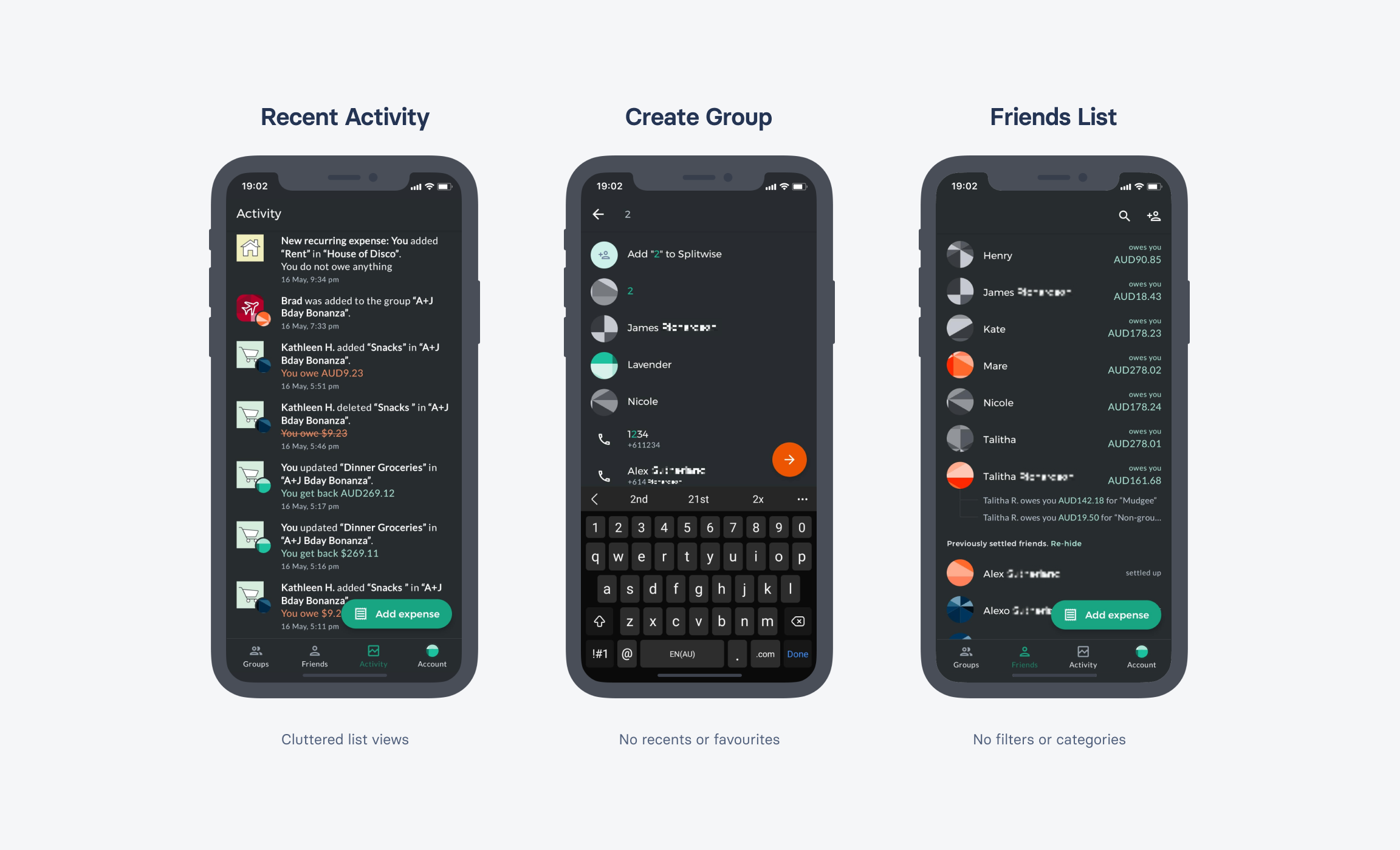
Screenshots from Splitwise that highlight some of the main friction points reported by users
RESEARCH
Users
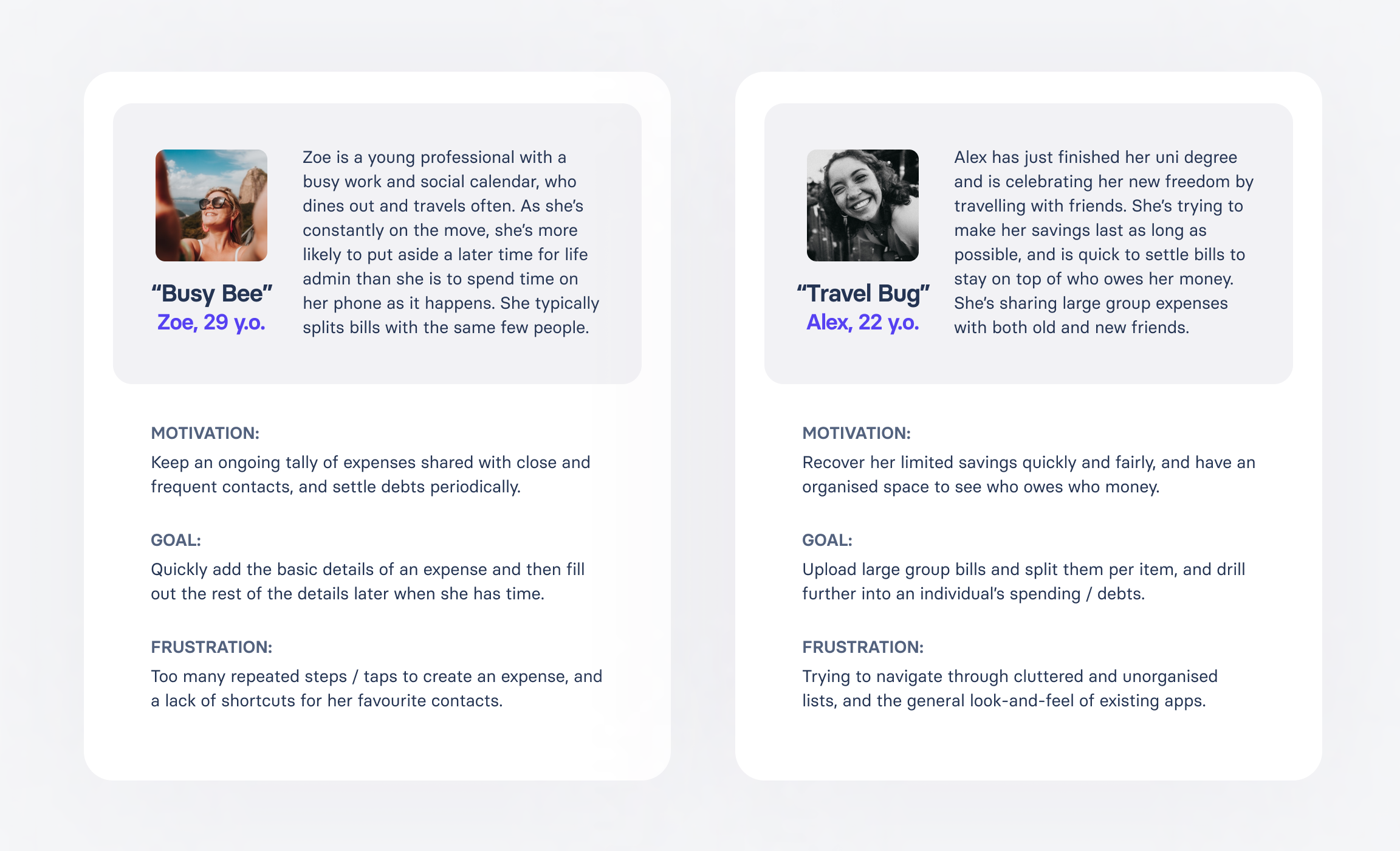
After interviewing Splitwise users I was able to identify some recurring friction points and get a better sense of what their ideal app would look like. From their responses, and the feedback gathered from reviews on the app store, I was able to create two target user profiles:
High Level Goals
01 / Assign friends to itemised receipts
Users wanted a bill splitting feature that allowed them to scan or upload a photo of a receipt, and then assign eachother to individual item lines. While this function exists in a few of the existing apps, it was either difficult to use, couldn't be completed on a single screen, or didn't allow for partial / later completion.
02 / 'I'll do it later' functionality
Everyone gets busy (or lazy), and sometimes users just wanted to quickly add in the basic details of an expense, such as the title and cost, without having to spend too long on it at the time of creation. One of the biggest points of friction reported in the existing apps was forcing users to add full contact information or split details for new expenses.
03 / Create shortcuts & reduce taps
Users that typically split bills with the same few individuals were frustrated that their favourite contacts were buried in cluttered, unstructured lists. They wanted a faster and more organised path to accessing these contacts when creating new expenses.
04 / Assess an individual's expenses
The 'simplify debts' feature that works in the background of Splitwise is great in theory, but with so much detail obsifucated away users didn't always trust that everything was accounted for. They wanted a clear overview of what expenses were assigned to each individual in order to quickly settle disputes.
And lastly...
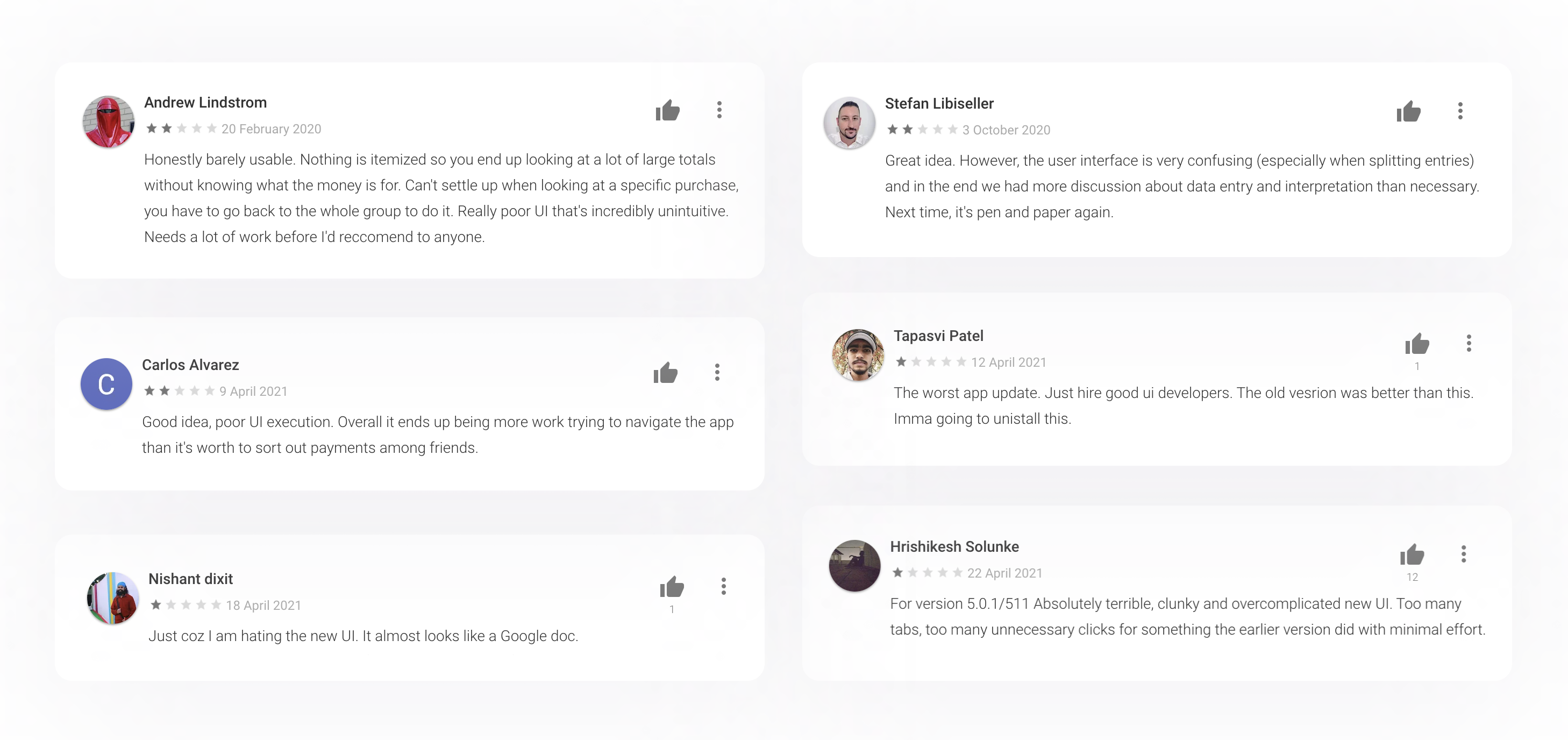
05 / Make it look good
 !
!
UX DESIGN
User Flows
I wanted to ensure both target users could easily move through the same flows, with the "Busy Bees" able to skip past certain steps and apply more detail later, while allowing the "Travel Bugs" to completely set up an expense and participants at the time of creation.
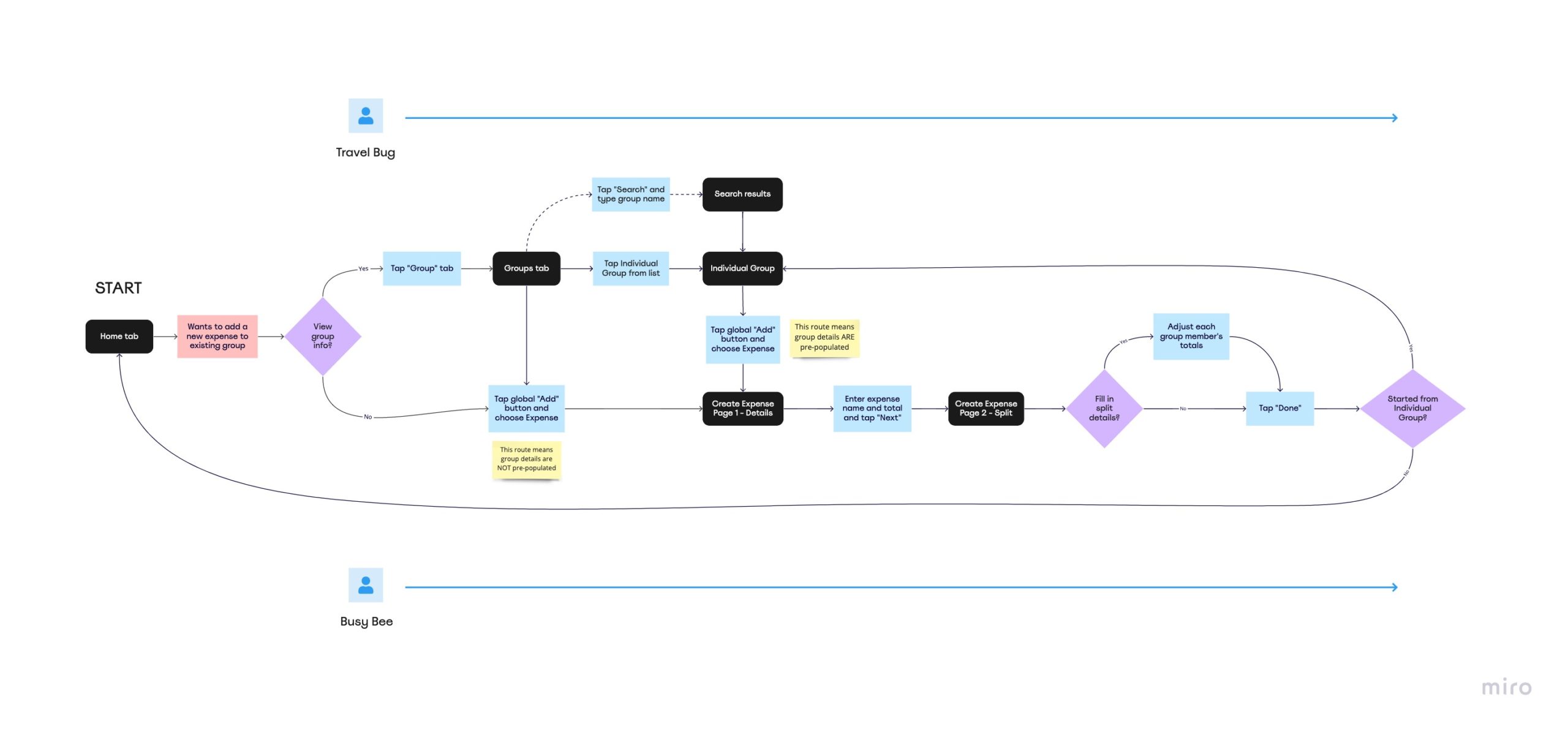
An example of the user flows catering to both target users, this one being the "Create Expense" flow
UX DESIGN
Wireframes
Once I was fairly confident the user flows catered to both profiles, I drew up some lo-fi sketches and over a number of iterations, turned these into more detailed UX Wireframe flows. Creating wireframe components in Figma helped keep things consistent and iterate faster, and would eventually make it easier to start designing the final UI components.
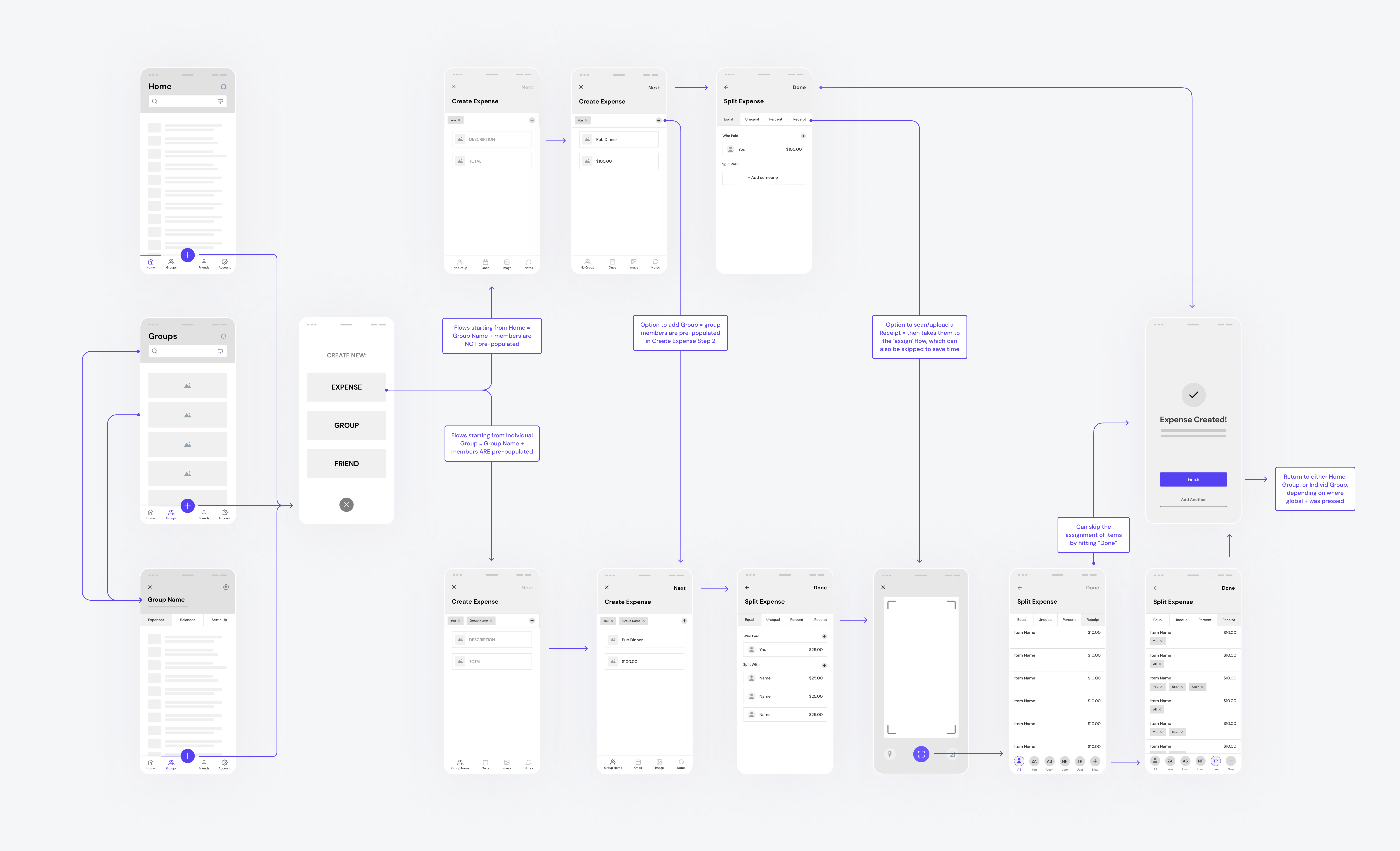
One of the UX wireframe flows created with basic Figma components allowed me to rapidly test my designs
UX DESIGN
Prototype
Once I was working with more detail, I turned these wireframes into an interactive prototype in Figma and asked some test users to complete simple tasks. In attempting to reduce the number of steps for the "Busy Bee", these tests illuminated that screens cluttered with interactive elements caused more friction than an extra screen, and I was able to eventually strike the right balance between them.
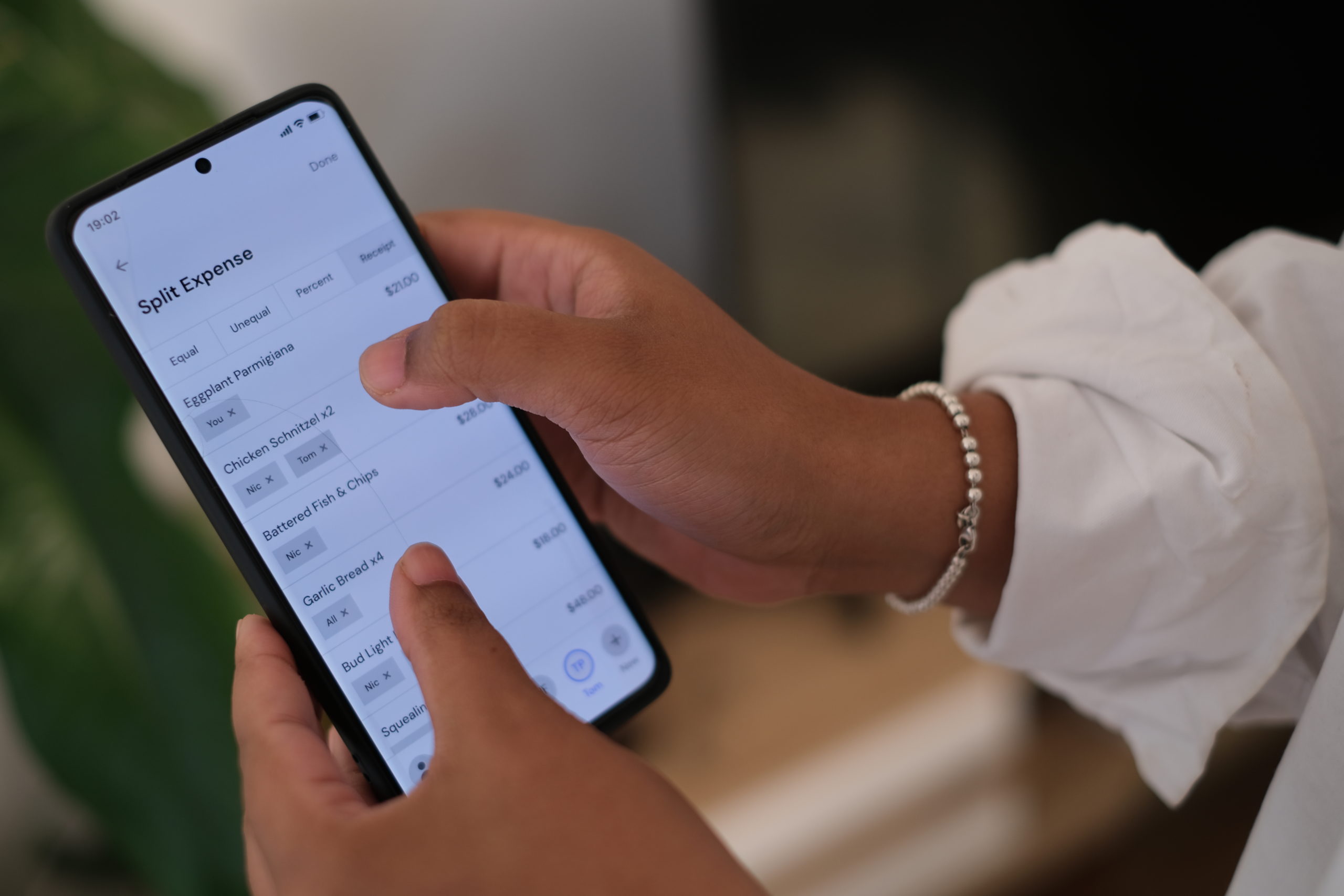
A test user working through a wireframe prototype of the "Create Expense" flow
UI DESIGN
Design System
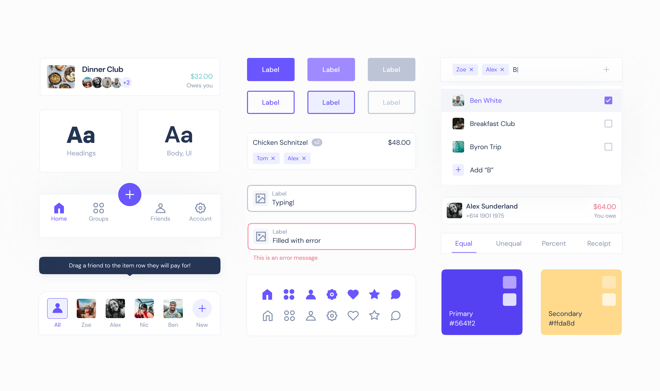
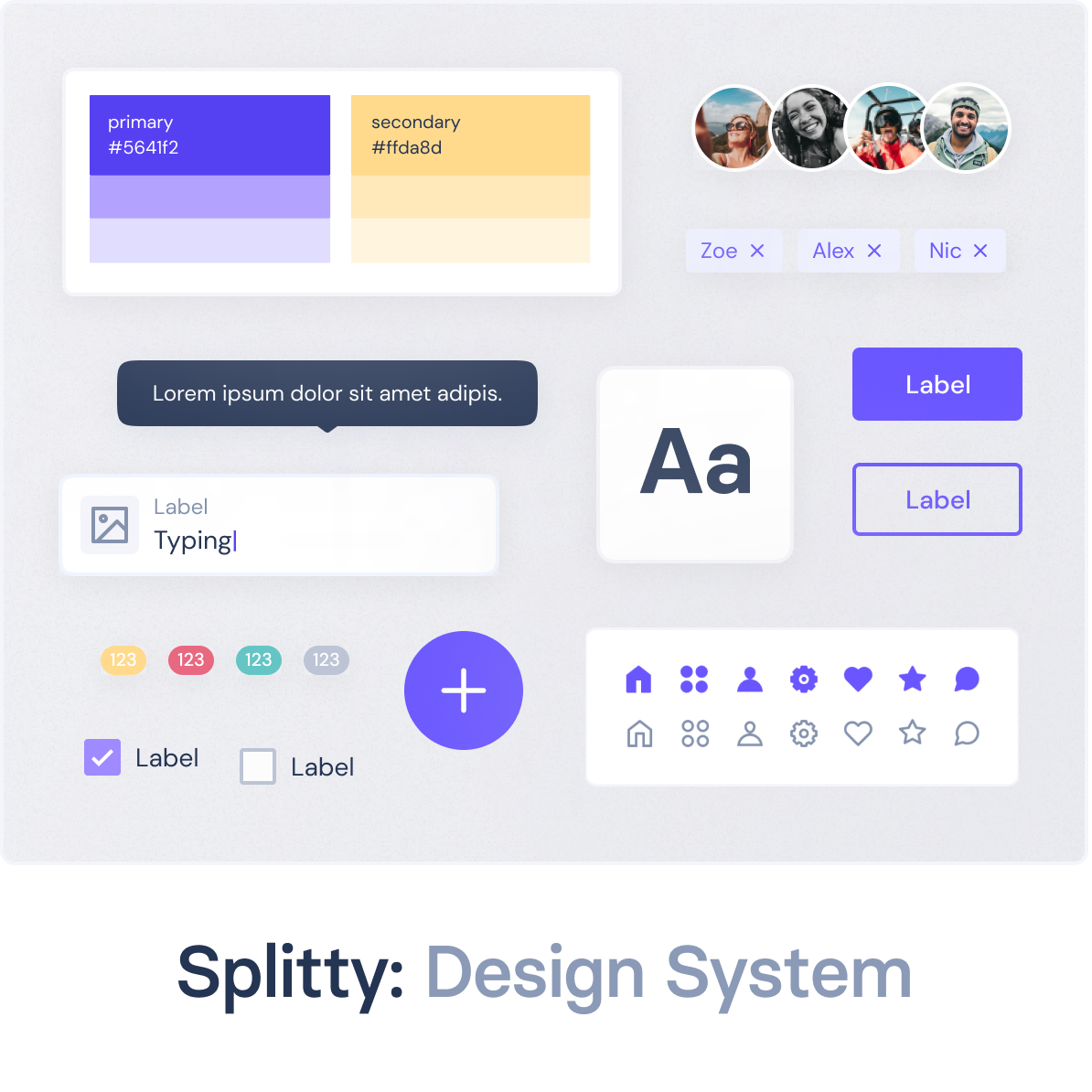
I created a design system of inter-dependent components in Figma, based on the Atomic methodology. This process helped me maintain the overall brand aesthetic as I rapidly iterated on the designs.
UI DESIGN
Final Designs
Using the design system of responsive components I had set up in Figma, I was able to flesh out the mobile app in full and test that each of the high level goals I had set out at the start of the project had been addressed.

HIGH-LEVEL GOAL 1
Itemised Receipts
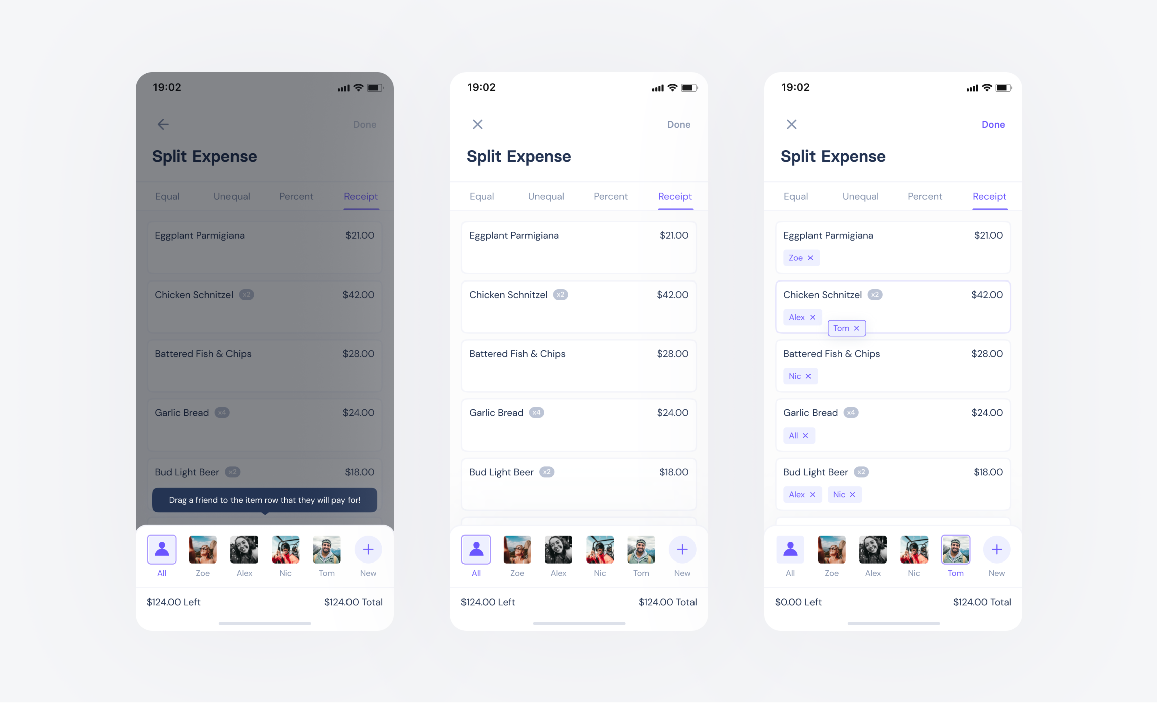
Splitty allows users to scan or upload a photo of their receipt, and then assign eachother to each line item. Where other apps had separated each participant onto a new screen, Splitty does this in just one, allowing users to allocate by dragging an avatar to a row. Line items can be manually added, and any item that isn't assigned by the time they hit "Done" is automatically split between "All" participants.
HIGH-LEVEL GOAL 2
"I'll do it later"
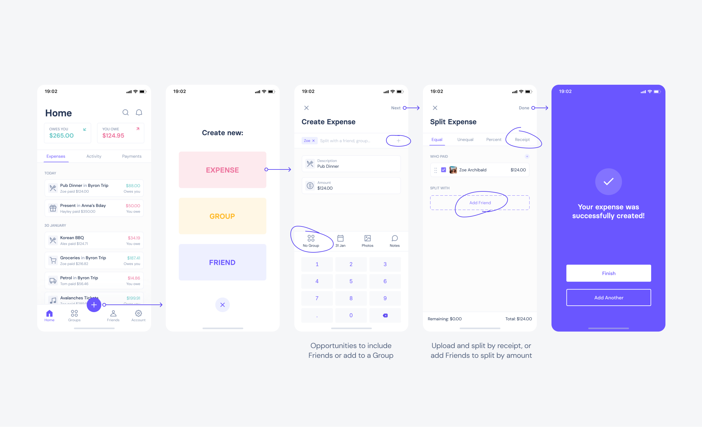
Rather than forcing users to assign an expense to a Group, Splitty allows them to create non-group expenses, with both being accessible from the Home tab. Not only does this provide greater flexibility in general, but it also reduces the overall taps for users short on time. Expenses started from within an individual Group page will have those friends pre-populated, while expenses started from any other page will be blank. There are multiple opportunities in this flow for users to add more details if they'd like to, which can otherwise be added in at a later time by editing the expense.
HIGH-LEVEL GOAL 3
Create Shortcuts
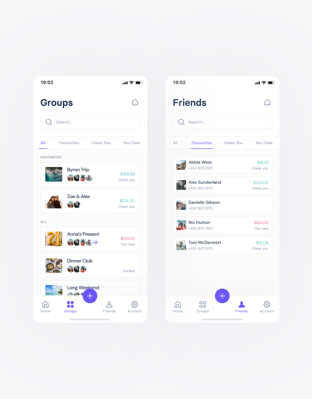
In addition to providing shortcuts when creating expenses, all lists (such as Groups and Friends) are categorised using tabs to allow for easier and more stuctured navigation, and to provide a faster path to a user's favourites. When adding friends to a new expense the user can select from their favourites, exposed at the top of the list, rather than having to scroll or manually type them out each time.

HIGH-LEVEL GOAL 4
Individual Breakdowns
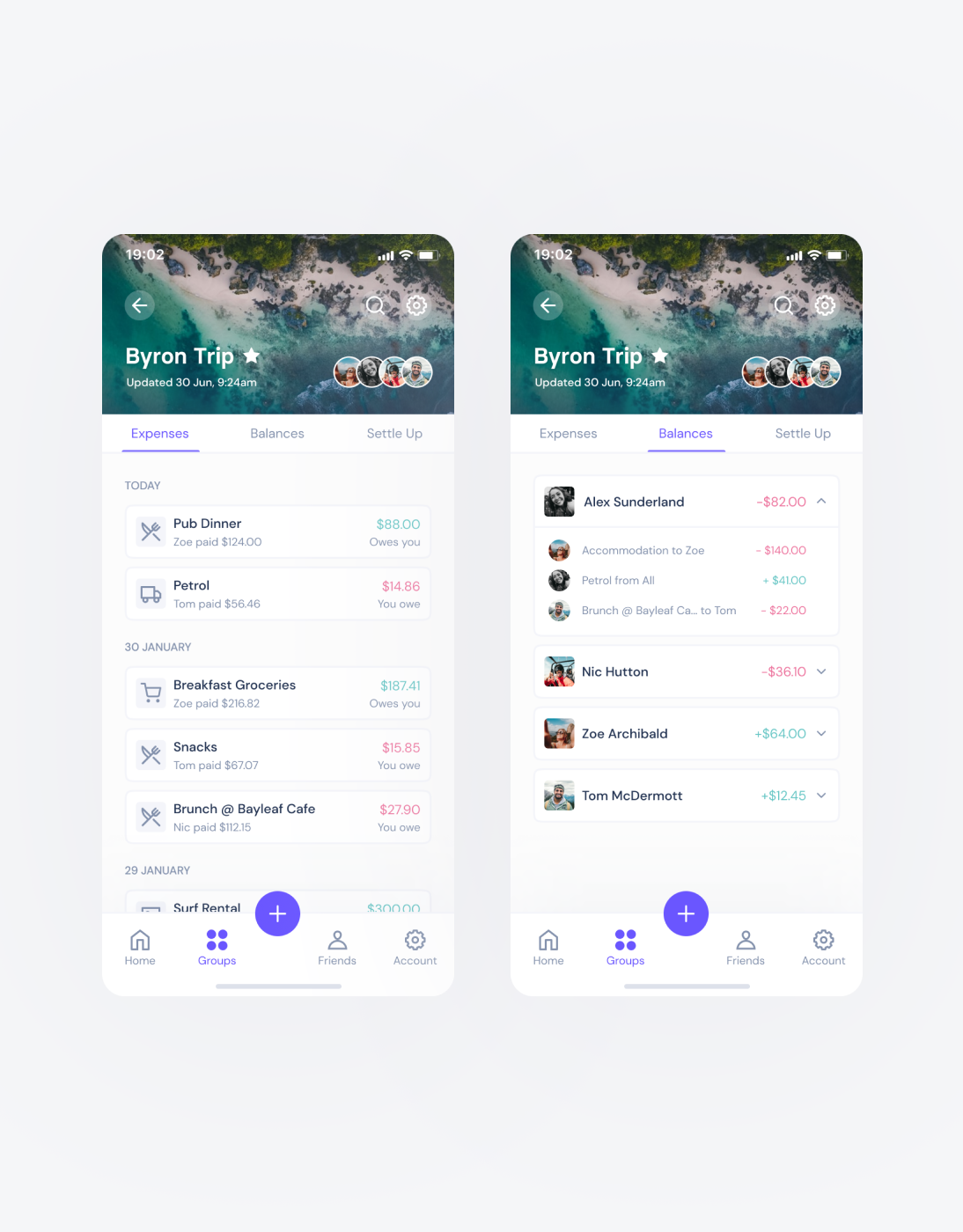
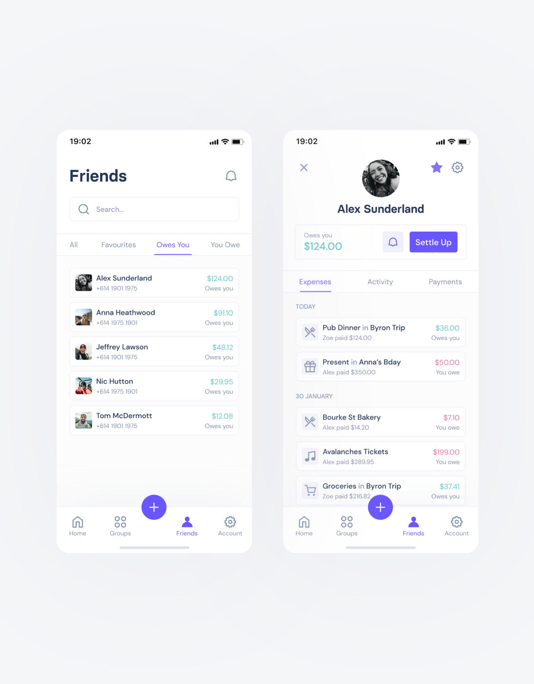
Users wanted a clearer way to view the expenses assigned to an individual within a Group, but they also wanted a better overview of their relationship from the Friends list. Using tabs as opposed to filters, drop-downs or modals made navigating these lists much more efficient.
See more projects
Splitty: Design SystemDesign System
Blueshyft: iPad POS AppUX/UI Design
Synthetix: Mintr Web AppProduct Design, Front-end Development