Splitty: Design System
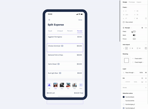
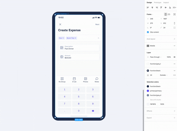
Splitty is a mobile app that allows users to easily share expenses between friends, settle trip costs, divide household bills, and more. With a lot of complicated calculations happening in the background, users needed a simple interface that conveyed reliability without looking like an Excel spreadsheet. The Splitty Design System is part of a personal project completed during the recent Covid-19 lockdown, allowing me to efficiently design a digital product with a cohesive user experience.
CLIENT
Personal
ROLE
Design System,
Branding
YEAR
2021
Laying the foundations
After being responsible for design audits, rebranding exercises and design systems in the past, I've had plenty of first-hand experience in trying to work through design debt that stems from a product designed with pages in mind, rather than systems. Not only is the look and feel of the product fragmented, but attempting to program a well-structured app when each component has a slightly different style quickly results in irreversible code bloat. From the user's perspective, as the nature of bill-splitting is complicated and frustrating, I wanted to remove any ambiguity by making sure they were able to frictionlessly move through structured and consistent flows.
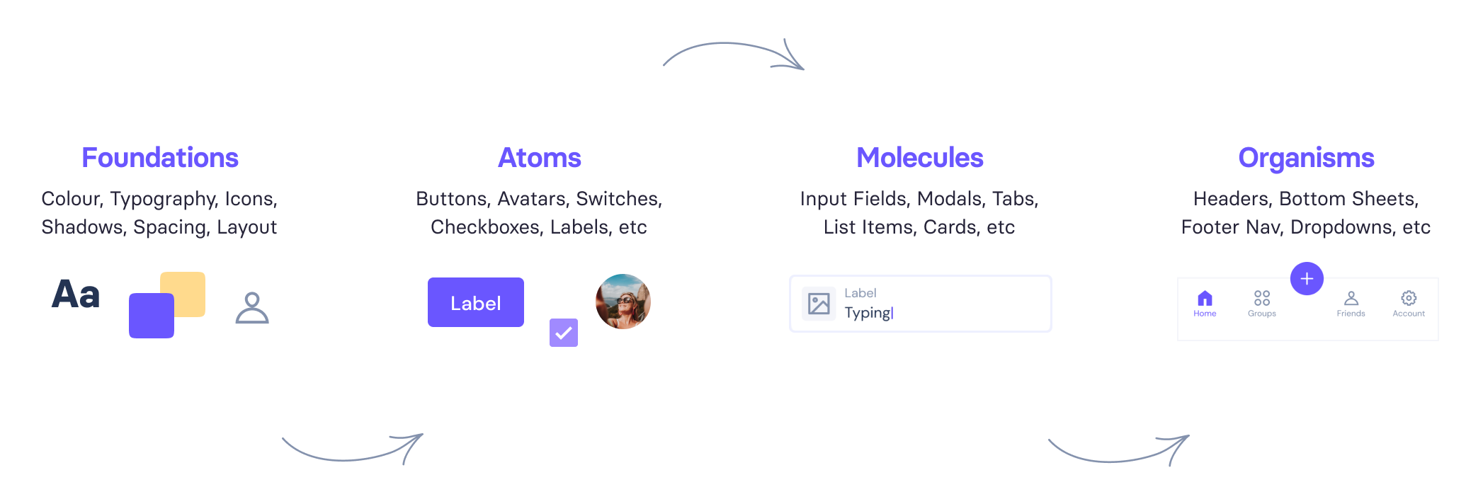
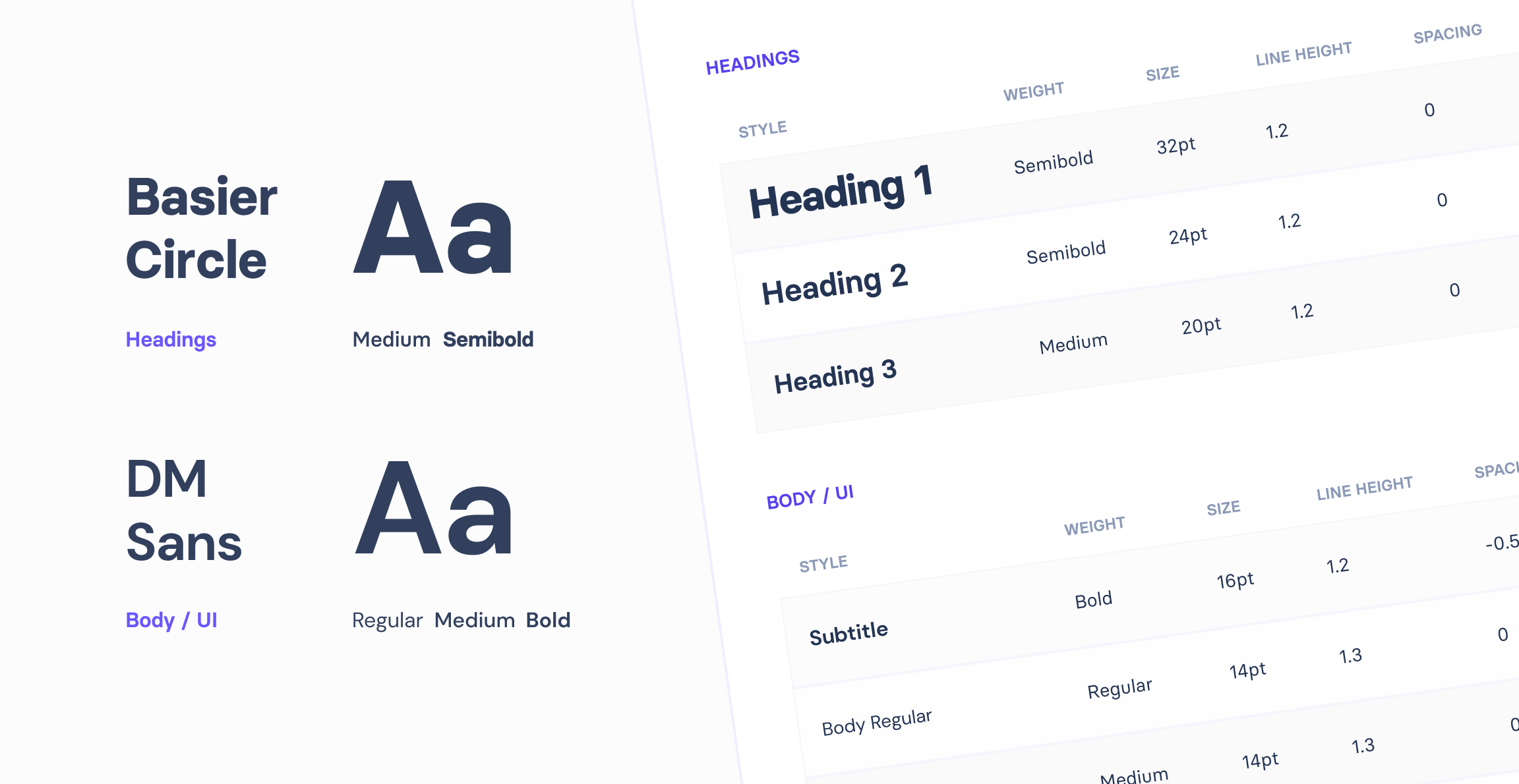
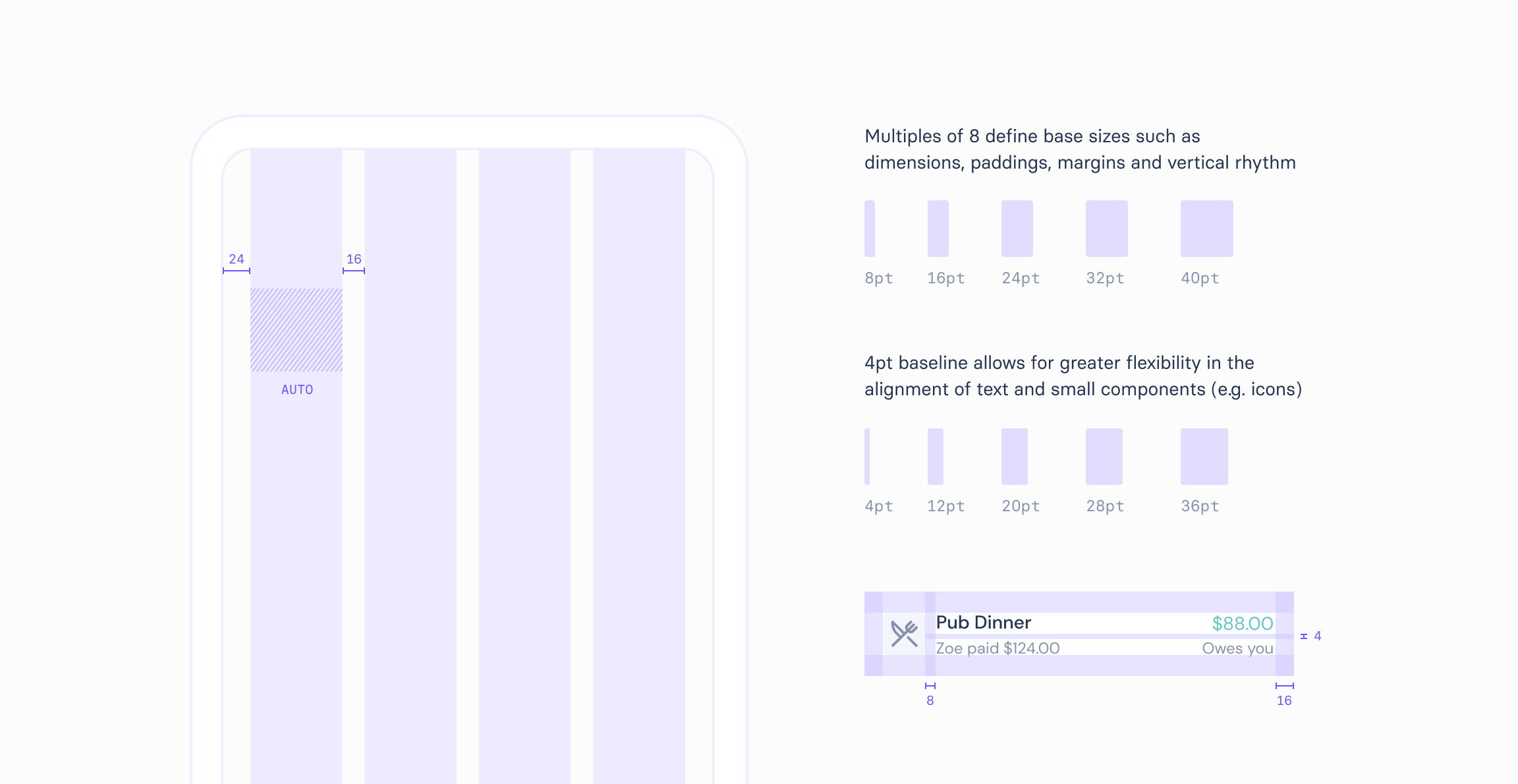
With these considerations in mind, I created a design system in Figma based on the Atomic methodology, in which the most basic components (or 'atoms') are combined to form increasingly complex structures ('molecules' and 'organisms'), that then come together to create reusable templates and live pages. This nested system of inter-dependent components allowed me to apply sweeping, consistent changes to my designs as I rapidly iterated on them. Underpinning this structure are the foundational level elements, such as colour, typography and spacing, established to maintain brand and consistency.
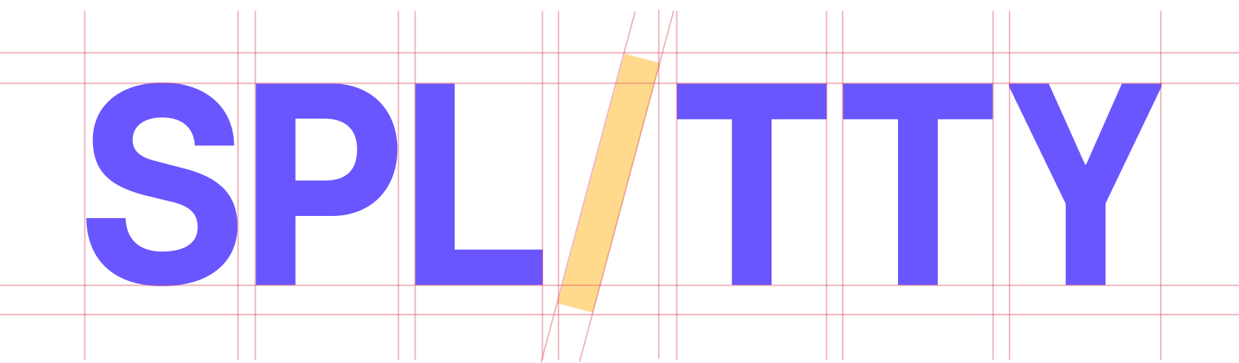
The name Splitty comes from a play on two of the existing products in the space, Splitwise and Kitty Split. The word 'split' in itself sounds sharp, and in a nod to the app's bill-splitting function, the 'i' lends itself nicely into a divide symbol that slices right through the middle, symbolising an even, fair split.
The most common complaint regarding the existing expense splitting apps was that their interface was either cluttered or too vague, and when users were needing to interpret the results themselves it ultimately led to a lack of brand trust. I wanted to create a product that was in line with some of the best modern apps today - clean and minimal for optimal usability, with pops of considered colour to keep things fresh.
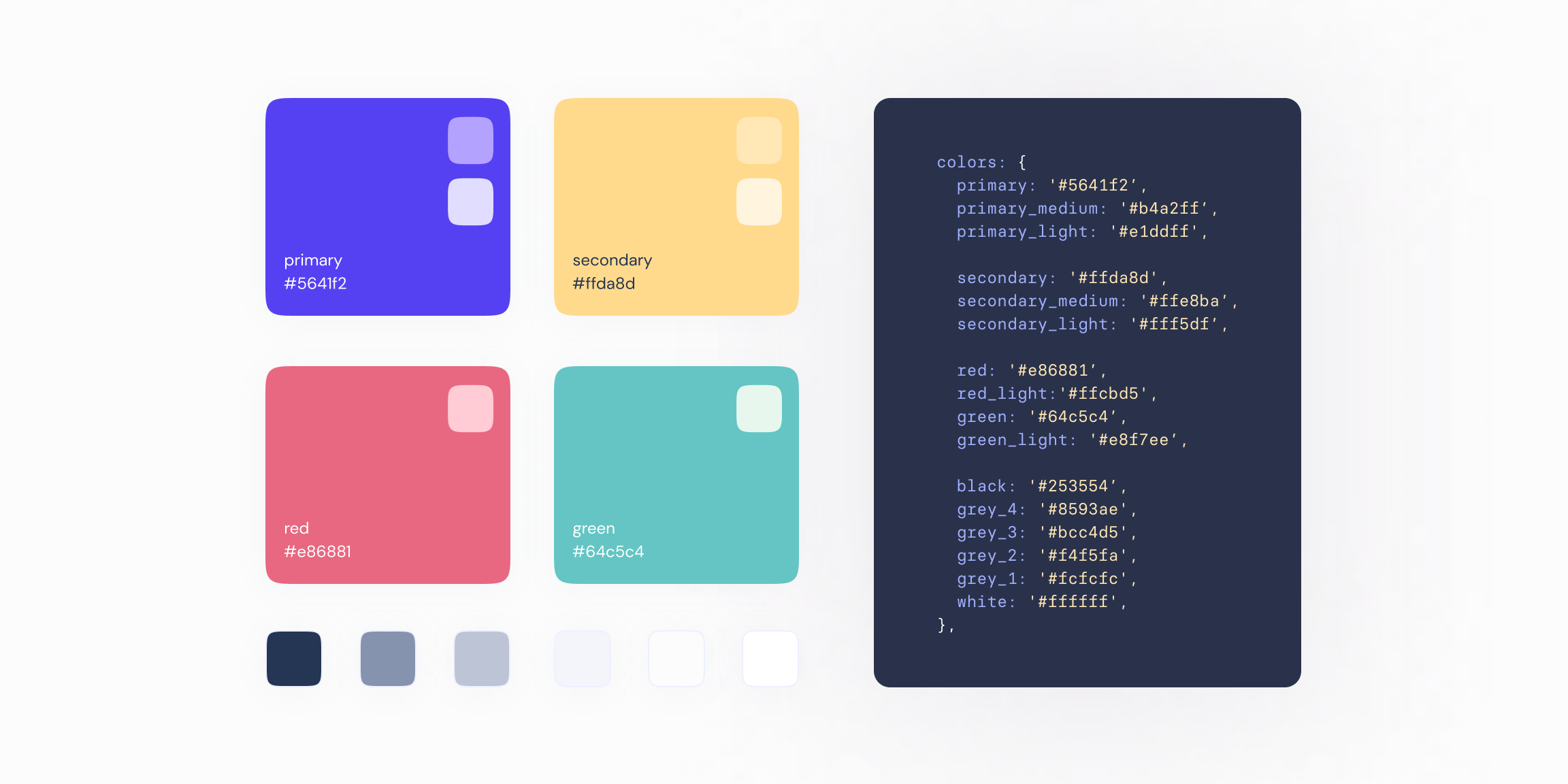
A vibrant, punchy blue strikes the right balance between being modern and dependable, and provides the user with a clear path through the app. This is supported by complementary vivid yellow that is friendly and communicates clarity. The grey and feedback palettes that form the functional side of the app have all been kept minimal to reduce design bloat and ensure their application remains flexible. Working with the four most 'basic' colours (blue, yellow, red and green) helps to illustrate the app's simplicity.
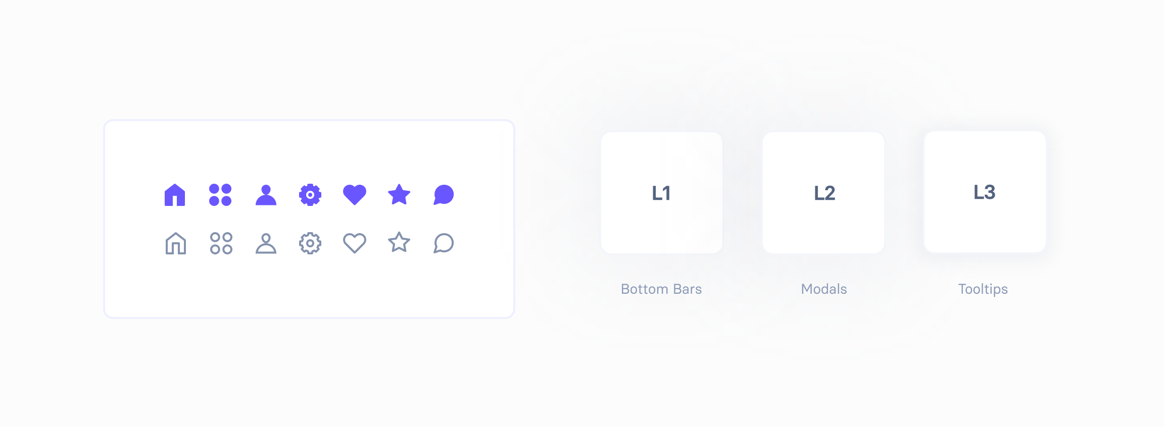
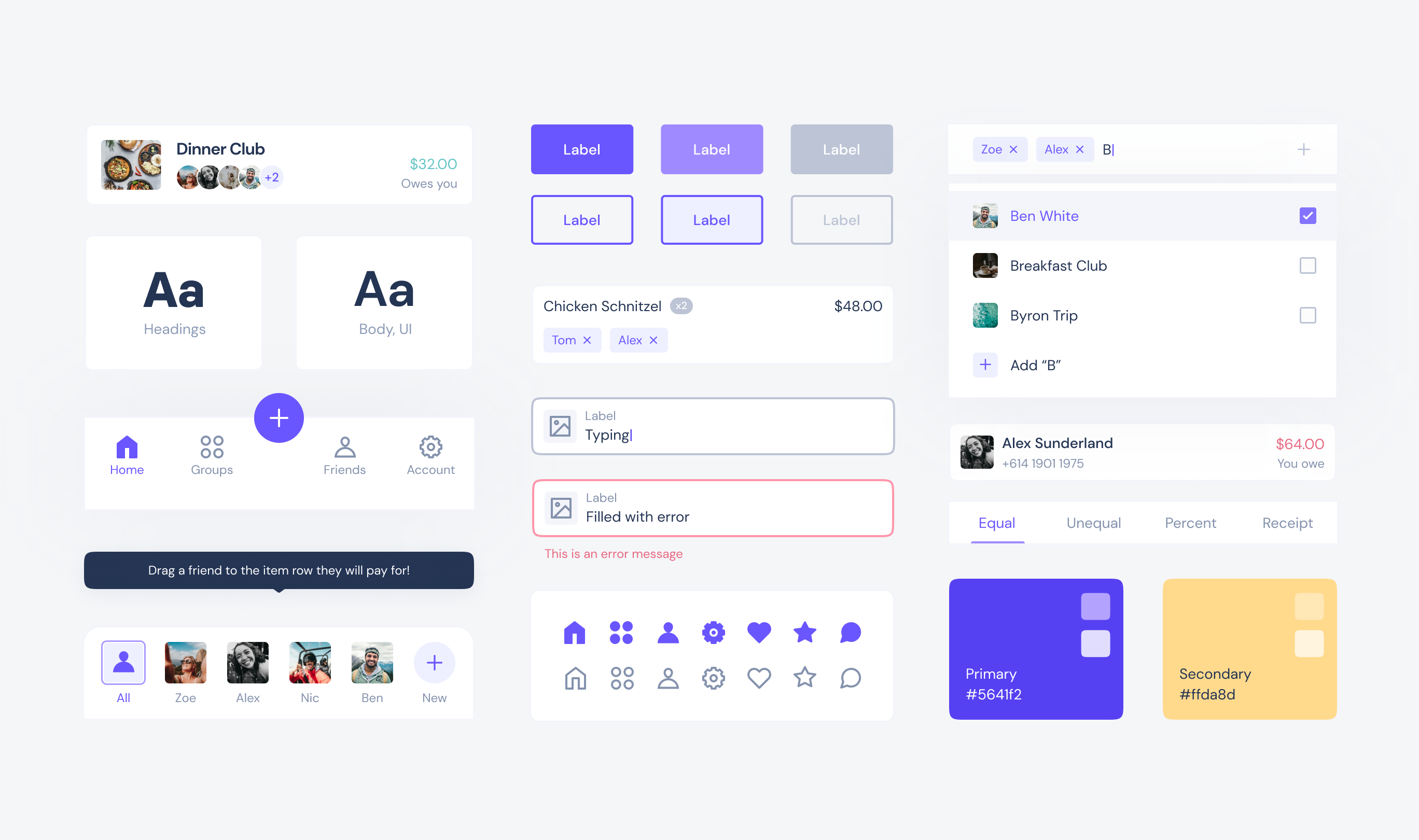
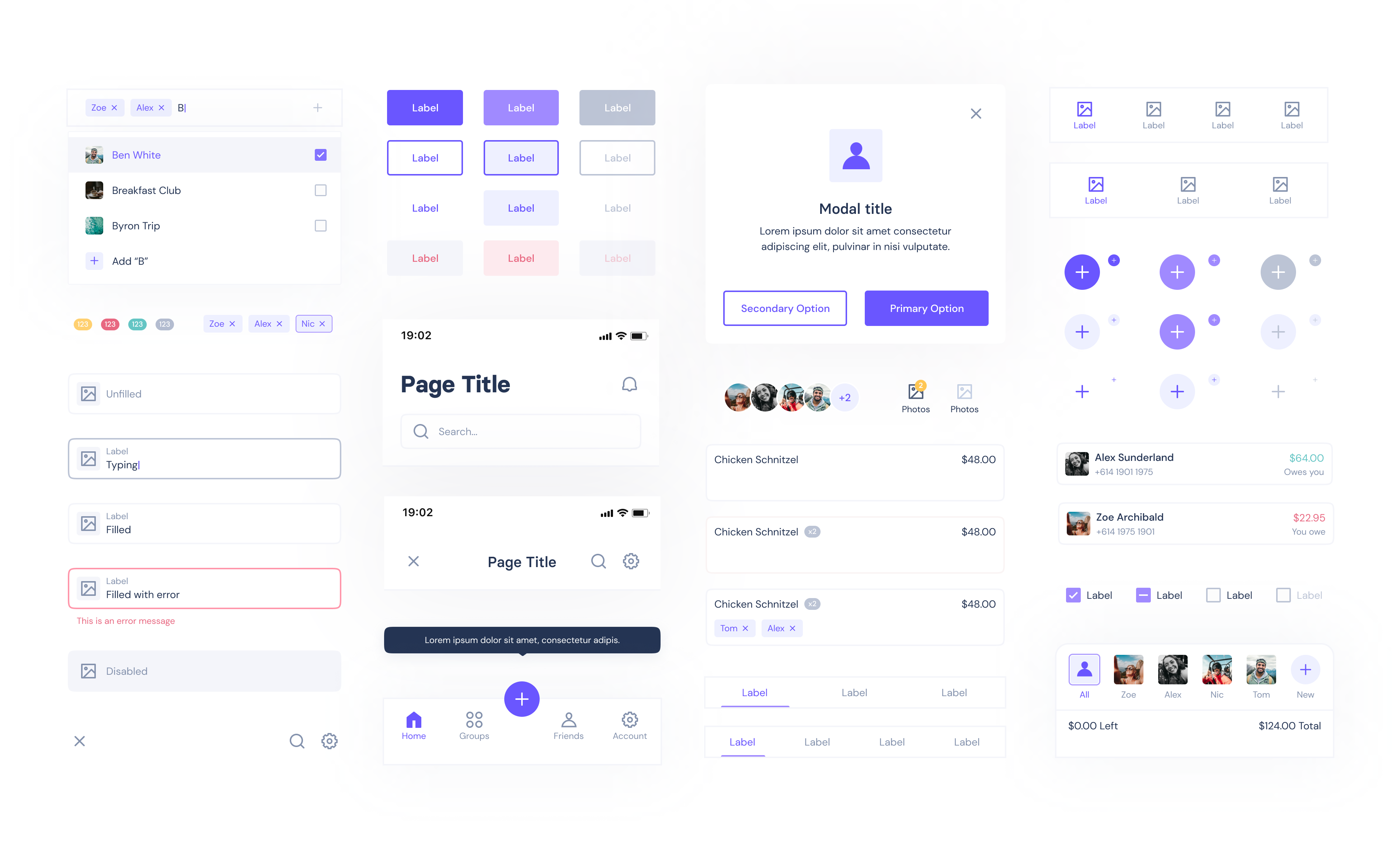
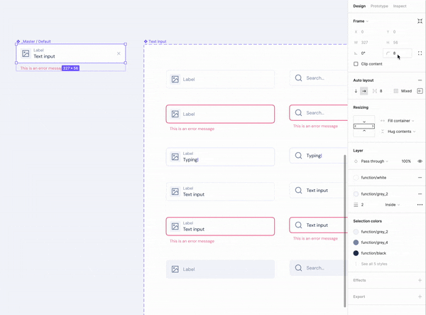
The component library
Once I had established the product foundations as styles in Figma, I used this to create a library of inter-dependent, responsive UI elements. For this project I worked with nested 'master' components, meaning as I iterated on the design, I only needed to edit the original component to then apply sweeping and consistent changes to all instances. I also relied heavily on Figma's variants feature to ensure I'd covered all states of a component (e.g. focused or disabled), which not only drastically reduced the time to prototype and test my designs, but would support documentation and developer handoff.
FEATURE 1
Masters & nesting
Working with nested master components meant that I was able to apply sweeping changes to all instances as I rapidly iterated on design, resulting in a cohesive user experience.
FEATURE 2
Variants & states
Figma variants allowed me to easily toggle between a component's properties and values, such as its state, and significantly sped up the ability to test my designs through prototypes.
FEATURE 3
Responsive design
All components were ensured to be completely responsive, with Figma Constraints and Auto Layout helping determine how an object should respond to changes in content and screen size.
See more projects
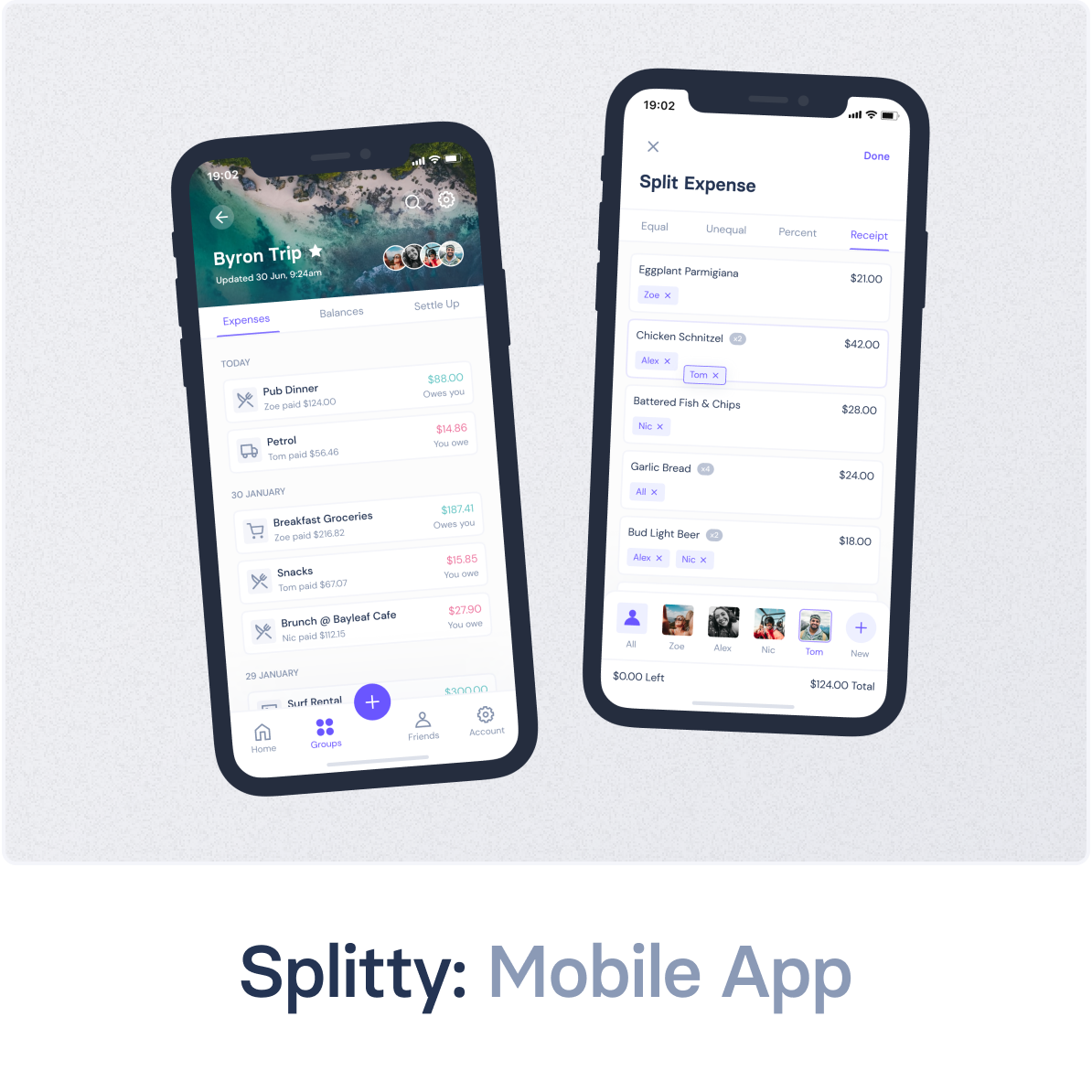
Splitty: Mobile AppUX/UI Design
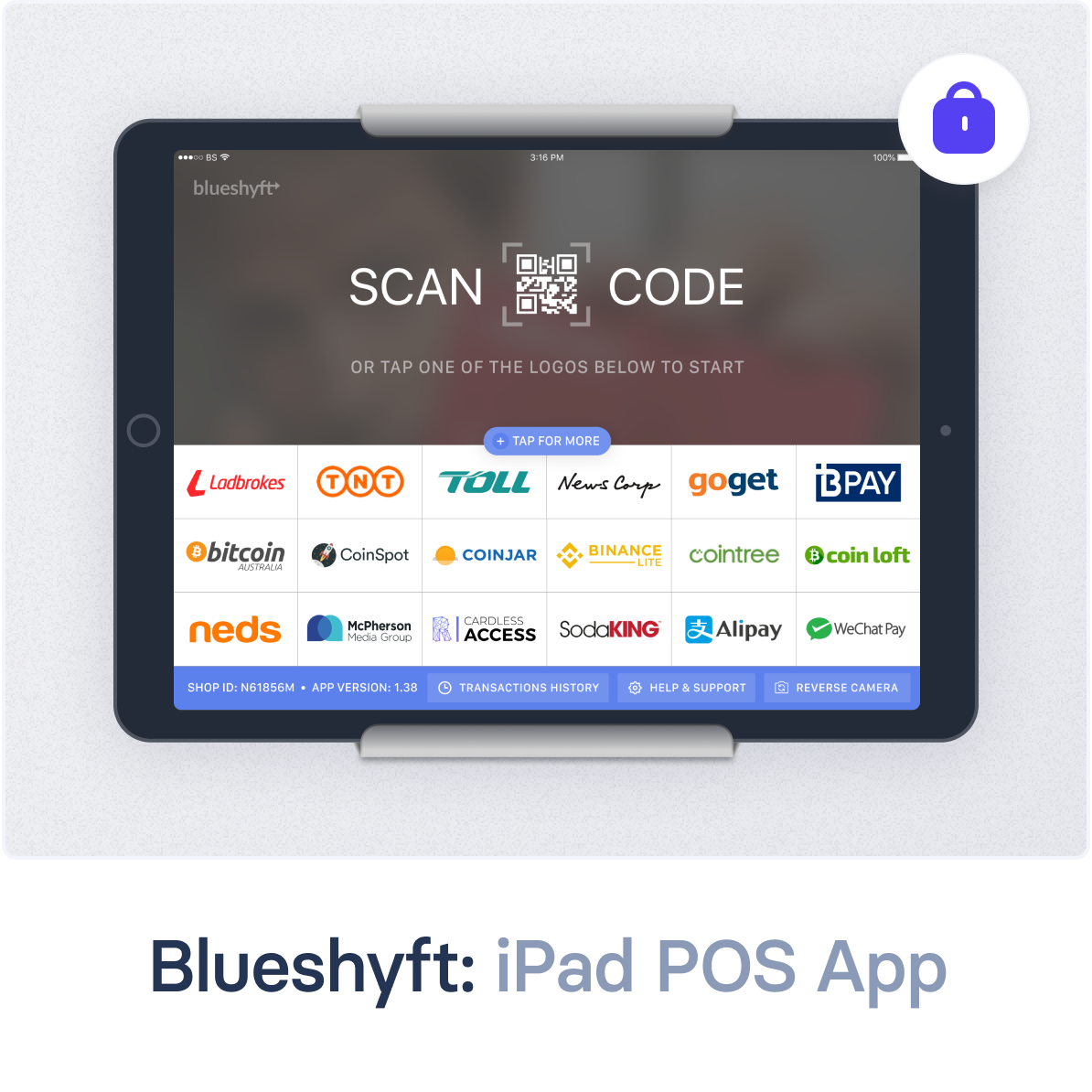
Blueshyft: iPad POS AppUX/UI Design
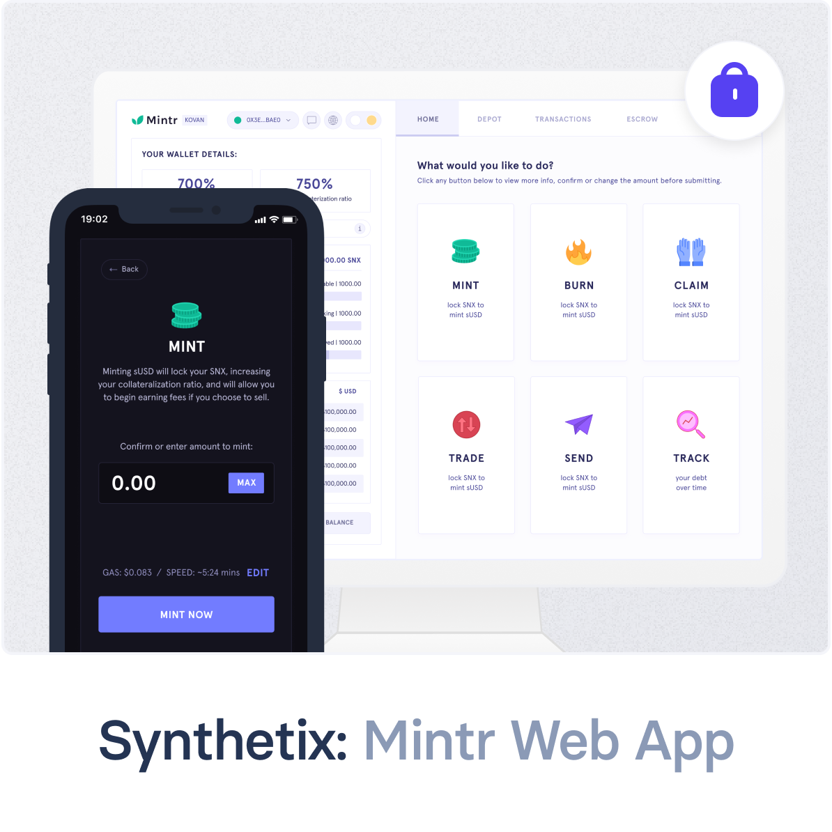
Synthetix: Mintr Web AppProduct Design, Front-end Development